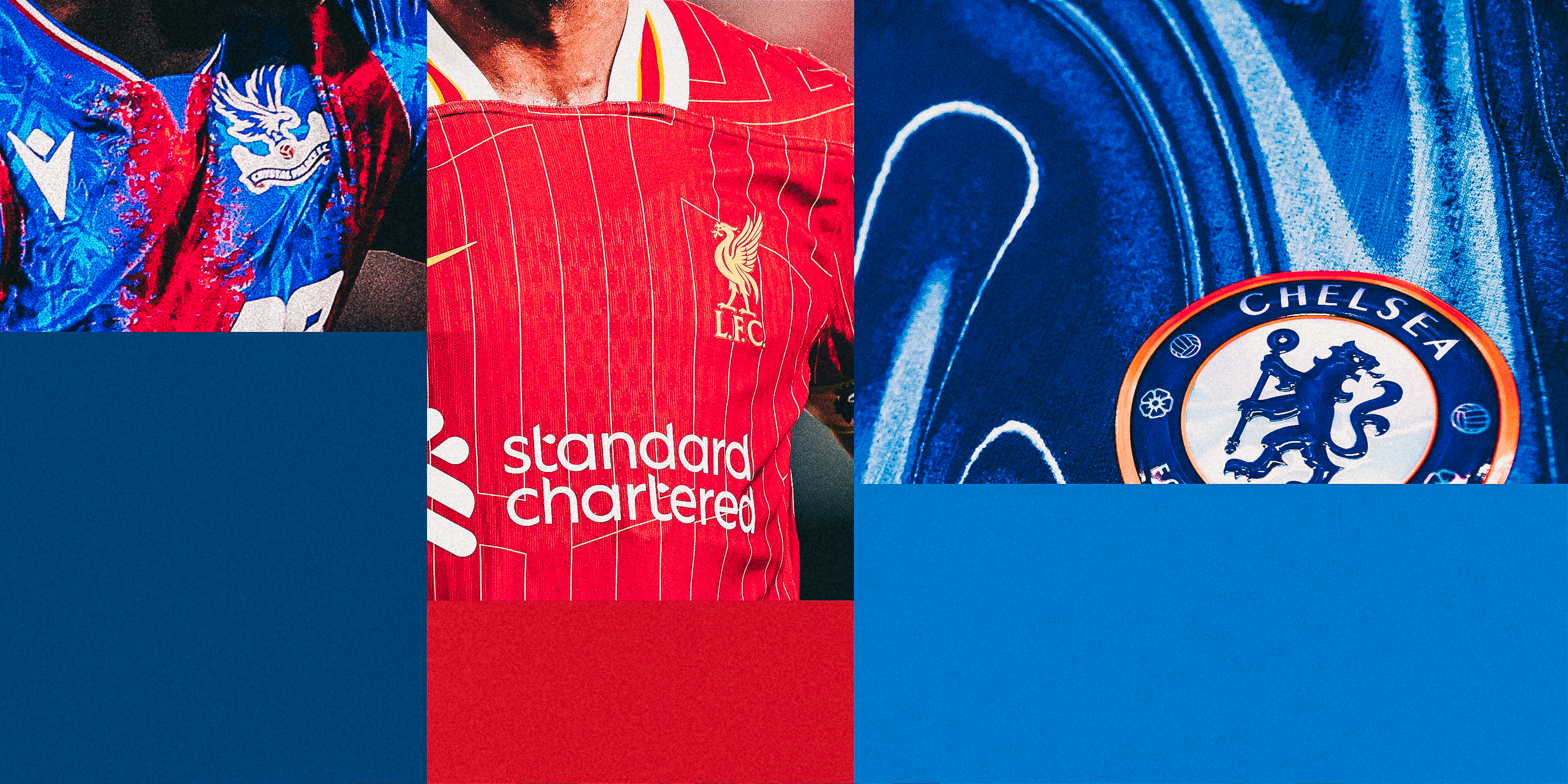
A new Premier League season is nearly here, which means only one thing: it’s time for footballers to stand moodily, staring straight ahead, possibly somewhere with artistic lighting and some extremely jerky camerawork, modelling their team’s new kit for the season.
A relatively new phenomenon has been clubs revealing the new kits to the players and filming their reactions, which virtually all inspire a forced grin and them saying slight variants of, “Yeah, that’s nice, that is.”
Of course, if they hated the shirts, they couldn’t say so… but we can. So here are this season’s new Premier League home kits: ranked.

Getty Images
Sweet fancy Moses. You do sometimes wonder how some things happen, and whether anyone actually genuinely thinks they’re a good idea. Person A suggests an idea they sort of half-believe in, Person B doesn’t really understand it but just says yes to avoid looking stupid, so Person A is emboldened, goes to Person C and says, “Well, Person B thinks it’s a winner”, and then it all snowballs from there.
That’s one of the only explanations I can come up with for this shirt, which really does look like someone has taken a baseball bat to a lava lamp, the result of which splooged all over a perfectly nice blue shirt.
It’s the sort of jersey that would exist if there were football teams in the sci-fi action film Tron. I don’t care for it.

Getty Images

Getty Images
Let’s address the elephant in the room here: this is not a Southampton kit. Sure, it’s got the Southampton logo, and Southampton players will wear it this season in Southampton games, but it’s not a Southampton kit. It’s a Brentford kit from around 2014, or perhaps at a push a Sunderland kit from a few years after that.
But it’s not a Southampton kit. Absolutely no way. And don’t let them fool you into thinking it is. Even if you don’t care about that… it’s just a bit dull, isn’t it?
Last season’s shirt was a glorious slice of retro Hummel, so it’s a double shame that when many more people will be watching them this time, they’ll be wearing whatever nonsense this is.

Getty Images

Getty Images
If you Google ‘Sudu’, the top results are a duel between Wolves’ new kit providers and a Malaysian restaurant in London. Would it be too sniffy to suggest that the chefs at the Queen’s Park-based eatery could have done a better job of designing a football shirt than their namesakes?
The theory is clear: Wolves’ owner Fosun Sports Group has a stake in the newly-formed Sudu, and will thus get a bigger cut of sales, which in turn makes the shirt cheaper for fans (£58 for the replica), but that isn’t much use when ticket prices have just gone up massively.
But we do also go back to the basic fact that this shirt looks like it has been designed by someone who has never designed a football shirt before. Which, to all intents and purposes, is exactly what it is.

Getty Images

Getty Images
It’s always a little disconcerting when a club returns to the Premier League after a long while away wearing a shirt that doesn’t actually look like the sort of shirt that club should be wearing.
With Ipswich, you want some familiarity, which means lots of white on the sleeves, if not completely white sleeves. Not this time: blue with white pinstripes and a darker blue collar. Those of us of a certain age and with a nostalgic bent would also prefer Fisons to still be their sponsor, although given they appear to have gone out of business, admittedly that is a bit of a tough ask.
It’s fine, but if you took the badge off, would you get in five guesses whose shirt this was? Possibly not.

Getty Images

Getty Images
I’m all for consistency in design, having a common theme running through your shirts…but isn’t this basically the same shirt West Ham had last season? And for 2020-21? And 2015-16? And 2011-12?
You get the point. It feels like West Ham have a system where they go for something slightly different for a year or two, then just fall back on this ‘classic’ design, giving a nod to their shirts from the 1960s and ’70s.
Which is not to say this isn’t a nice shirt. Shorn of context, it’s lovely. A great example of how to do clean and simple. But it is a bit rum to ask people to ditch that shirt they paid £75 for a year ago — old news, no longer relevant, get with the programme, grandma — and pay £75 for a new one, when the only change you’ve made is a slightly different collar.

Getty Images

Getty Images
Area codes are big news in football right now. Lamine Yamal was big on the 304 postal code of the town he grew up in during Euro 2024, while City appear to have based their new kit around the Manchester dialling code — 0161, displayed on the collar and cuffs.
It’s the only real detail on an otherwise entirely plain sky-blue shirt, the problem being that the pattern they’ve used makes it extremely difficult to make out the numbers.
From a distance of more than about three yards away, it looks more like a loose attempt at camouflage, but even closer up the 0 looks like a ’u’ and the 6 looks like nothing in particular. So, nice idea, but it does seem a bit pointless when you can’t actually see it.

Getty Images

Bournemouth
Bournemouth were the last of the 20 Premier League teams to release their new kit, spending the interim messing around with some odd shirt designed by their celebrity part-owner Michael B Jordan that they’d only wear in pre-season.
So the question is: was it worth the wait? To which the answer is: sort of! It’s a perfectly decent design, the stripes are strong and the red and black colour combination is always going to be pleasingly bold.
But you are always slightly suspicious when teams who don’t usually have gold on their shirts suddenly throw a bit of gold on there. Why? It all feels a bit ”the football club doth protest too much” — them trying to project the image of glamour and success, when just winning games would do that rather more effectively.
This is available to buy without the awful gambling logo on the front.

Bournemouth

Getty Images
”Extra stripes, extra style”, is how Brighton launched their new kit in July, which as a marketing strategy does feel a bit like those razor companies who just add an extra blade and call it the next great leap in shaving technology.
More stripes is good, right? Because it’s more. And more is better than less. More is good. More! It’s actually a pleasant-enough shirt, with those extra stripes placed down the middle of the existing stripes in some sort of stripe-ception attempt.
Elsewhere, it’s fairly straightforward, with a big chunky collar and big chunky cuffs, next to the slightly unusual sleeve sponsor of the Kissimmee, Florida tourist board.

Getty Images

Getty Images
Adidas seem to have gone for a ‘less is more’ approach across the board with its kits this season, basic designs that have a nod to the company’s template from the mid-2000s.
Which is fine, I guess, but it has led to a bunch of shirts that sort of look the same: Leicester, Fulham, Manchester United and Nottingham Forest are all basically the same design with the colours changed (though there is some different detail on the latter two), which feels like a bit of a swizz.
Maybe it’s unrealistic to expect wildly different designs for each team, but it would be nice to have just a little bit of variation.

Getty Images

Getty Images
The sales spiel for this otherwise fairly plain shirt talks of a ”subtle gradient design on the front and back”, and just in case you weren’t 100 per cent sure what that means, they’re talking about the bits where it makes whoever is wearing the shirt look like they are sweating from the navel up. Otherwise, it’s another cookie-cutter Adidas top but with that ”subtle gradient design”.
We also need to dwell on the other Adidas common design, which is the weird band things on the shorts. They basically make it look like all the players are wearing braces and they’ve let them fall off their shoulders, calling to mind the sexy and moody character in a Victorian drama who is caught in an unguarded moment with his blouson undone and a few inches of chest on display, setting hearts a-flutter.

Getty Images

Getty Images
Back to basics for Fulham this season, after their renegade ”red stripes on one shoulder, white stripes on the other” effort last season. And while it’s very simple, it’s also quite nice, with the caveat that the red flashes up from the hips do make it look a bit like a Bolton shirt from the early 2000s.
It is a little spoiled by the sleeve sponsor, a massive logo of something called WebBeds, which, as you well know, is a B2B accommodation distribution company.
Last season, their logo was rather more unobtrusive, but this time they clearly decided not enough people could see it from the planes flying over Craven Cottage on their way to Heathrow airport a few miles down the road, so now it’s about three times the size of the club badge.

Getty Images

Getty Images
Another from the Adidas template box, but at least this shirt does have an element of team-specific detail to it.
Forest are obviously very big on their two stars, which you can see above the club badge there, commemorating the European Cups they won in 1979 and 1980. The background design to this shirt also reflects this, and it works quite well: subtle enough not to be overpowering, obvious enough that the people who need to notice, will notice.
The whole thing is spoiled slightly by the sponsor’s logo, which at the same time as being for a betting company that is not licensed in the UK, is just a really ugly logo.

Getty Images

Getty Images
Do you have a TV show that you really like, but at the same time you completely agree with all the criticisms of it? The West Wing, for example: it’s smug, the dialogue is nothing like how anyone has ever talked in real life, it presents itself as progressive but is fantastically patronising to women, and there’s no way Toby would have ever leaked those details about the space shuttle. And yet, I love it and occasionally watch episodes when I want something comforting.
Which is a roundabout way of saying that this Palace kit, which looks like the art project of a student who has been encouraged far beyond their talent and needs someone to tell them ‘no’ once in a while, is great.
I recognise that, objectively, it’s a mess. But if I was a Palace fan, I’d have been there outside the club shop at 9am the day it went on sale. I love it. Sue me.

Getty Images

Getty Images
There’s something… I dunno …comforting about this Everton kit. I’m instinctively annoyed they have moved away from having their shirts designed by Hummel, which means no team will sport those glorious chevrons in the Premier League this season.
Despite moving to Castore, a brand that seems more at home making polo shirts for rugby fans, this is really quite good. I can’t really explain exactly why, other than the fact it looks like an interpretation of the kit they wore when winning the FA Cup in 1994-95.
That doesn’t appear to be deliberate, going by the blurb released with it, but as a shirt to wear during their last season at Goodison Park (if all goes to plan), this is very good indeed.

Getty Images

Getty Images
Arsenal have played around with the colours of the three stripes on the shoulder of their shirts ever since returning to Adidas in 2019. They’ve had white on red, blue on red, gold on white and now, in the opinion of your noble kit ranker, the best combination anywhere this season with blue on white.
You need strong contrast, as a rule, and this is most certainly that, a shirt that is a tribute to one they wore in the early 1990s. It’s a little different while still being identifiably an Arsenal kit, and also features just the cannon logo (as opposed to the cannon as one element of a shield) for the first time since 1990.
Very strong, although the Emirates logo does seem weirdly massive this year.

Getty Images

Getty Images
Listen, fair play. Adidas’s emotional return to Newcastle was always going to be catnip to those of us who fondly remember the club’s freewheelin’ 1990s and early 2000s glory days, and it doesn’t disappoint.
Here’s proof that you don’t need to do much with stripes, just ensure they’re not too thick and not too thin, and make some sort of provision on the back so the players’ names and numbers are clear enough, and you’re away.
The black sleeves mean that, of the Adidas kits of yore, this probably most resembles the 2002 shirt, sported by your Alan Shearers, Craig Bellamys and Laurent Roberts.
It’s so nice you can even briefly forget that the main sponsor Sela, with its lovely clean typeface and logo, is an arm of the Saudi Public Investment Fund.

Getty Images

Getty Images
It’s our now annual firm congratulatory handshake to Brentford for continuing their policy of only releasing one new kit per season, a retro move presumably designed to make them stand out among the crowd of teams so perpetually happy to rinse their fans.
They will thus be sporting the same home kit as last season in 2024-25, and while that is a bit of a pity because that one is a bit rubbish, we’ll let them off on this occasion.
Well done, Brentford.

Getty Images

Getty Images
Everyone Villa-related seems pretty happy about life these days. Even selling Moussa Diaby, who was so electrifying in the first half of last season, seems to have been greeted as the shrewd business of a sensible football club.
Everyone was in an even better mood when this kit was released, and rightly so. It’s a delightful thing, Adidas managing to pull off the feat of designing a kit for a team they never have worked with before, while at the same time not making it look weird and out of place.
The shade of blue on the sleeves is lighter than it has been in some previous seasons, which is a canny move because it makes the maroon stripes pop all the more. The pattern on the collar is also a nod, unless I’m much mistaken, to the design worn when Villa won the European Cup in 1982, which is a lovely little touch.

Getty Images

Getty Images
You have to assume this wasn’t at the forefront of Nike’s mind when it designed this shirt, but the solid block dark blue sleeves are an interesting choice for Tottenham, given that for the last competitive game they sported this design, half the team had spent more time in the toilet than on the pitch. That was in 2006, and the match in question was the infamous ‘lasagne’ game against West Ham, when many of their squad had been struck down with food poisoning.
Calamitous gastric reminders aside, this is a really great looking shirt, clean and bold, with the sponsor’s logo in bright red actually adding something to it rather than looking awful (although it could probably do with being a font size or two smaller), while the shorts are dark blue rather than white, which is as it should be.
Yes, yes and yes. Just be careful that everything you eat is cooked through properly.

Getty Images

Getty Images
The trouble with teams wearing their new kits for the last game of the previous season is you forget that’s actually their new kit. Genuinely went searching for a few minutes for Liverpool’s new shirt, because I just assume this wasn’t it, having already seen it in action. Which is more a comment on my declining faculties than the kit itself, which is truly excellent.
It might be slightly tricky to do but while they’re sorting out the financial rules or tweaking VAR to pretend it makes the slightest bit of difference to that dreary blight on the game, the FA or the Premier League should really put a law in place that stipulates Liverpool should always have a splash of gold/yellow on their kits.
There’s just enough here, and in addition the collar is excellent and the broken-up pinstripes thing works. Gold stars to everyone involved.

Getty Images
(Photos: Getty Images/Design: Dan Goldfarb)


